A new home for patient care
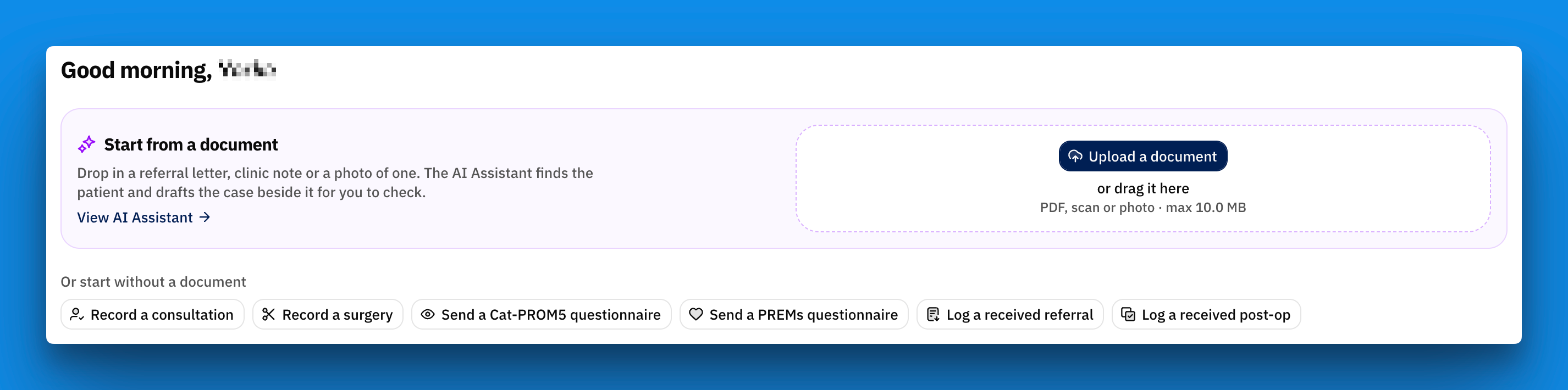
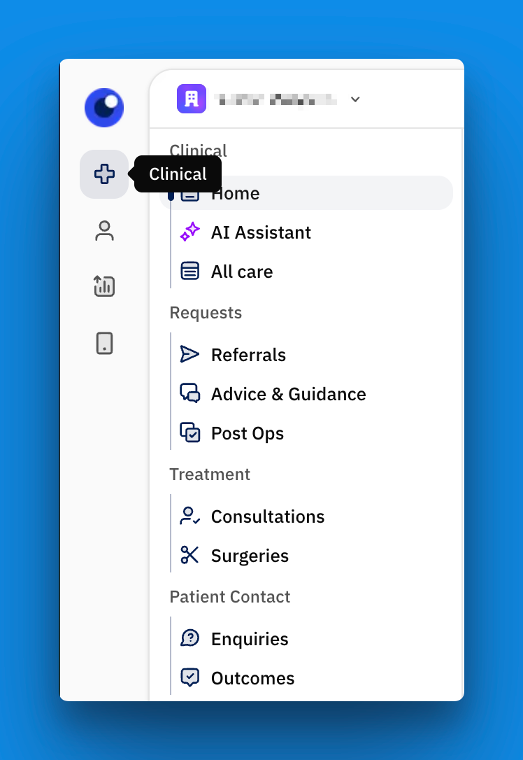
Over the past few weeks we've been reworking how Lutra presents data so that each type of work has its own home. You no longer have to open one big inbox and click into something to get anything done. Referrals, Advice & Guidance, consultations, surgeries, post-ops and patient outcomes each have their own home.
A new home for patient care
A consistent view across all patient care, whether it’s a referral or a post-op - all can be found within the Clinical menu.
Referrals
One page for all things referrals. Hospitals see their Incoming referrals and optoms see Outgoing ones. Both can track Drafts, and each tab shows a count so you can tell at a glance where the work is.
Check public referrals in place. When a referral comes in through your public page, you can check the patient and start the referral right beside the original submission, with the form already filled in from the document.
Advice & Guidance
Each request reads like a conversation. Your messages and theirs appear in order, with advice clearly marked and attachments inline.
Always know whose move it is. To advise, Needs your info or Advice received. A dot marks anything that has changed since you last looked, and requests with fresh replies move to the top.
Turn advice into a referral with one click, or close a request with a note. The other side is emailed each time a request moves on.
Consultations and Surgeries
Dedicated pages for consultation and surgery records. Each record opens with its key facts and a quick way to arrange a follow-up.
Post-ops
A new Post-op inbox for reviewing post-operative assessments.
Patient outcomes (Cat-PROM5 and PREMs)
All of a patient's outcome measures on one page, grouped into Needs review, With patient, Scheduled and Closed.
Scores front and centre. Each outcome highlights the score and totals to make answers / results quick to read.
Share, resend and see the send history for each questionnaire, know what has already been sent.
The patient record
A new Patients page and record tabs. You can move between their referrals, consultations, surgeries and outcomes from tabs at the top of their record.
The care tracker. A patient's Overview now gives one picture of their journey: what has happened, what's expected next and anything that needs attention. The referring practice and the hospital see the same picture, so everyone is working from the same story.
New records file themselves. When you start a new record, Lutra works out which part of the patient's care it follows, so we've removed the manual step of "which episode does this belong to?". If both eyes are in play, it only asks which eye. The form tells you where the record was filed, with a change link if it got it wrong.
Choose who can see a record. Consultations and surgeries now have a Visibility setting: Private, Specific organisations or Public. Records shared with you are marked Shared by … so you always know where they came from.
Outcomes tab. A patient's Cat-PROM5 and PREMs results are on their record, so you can review them without leaving it.

Dashboard and AI assistant
Upload documents for the AI assistant from the dashboard, where you start your daym no need to navigate the app.
Go straight from the AI assistant to the referral. Once it has read a document, the referral opens directly so you can carry on.
NHS/CHI numbers are picked up automatically from uploaded referral letters.
Notifications
Referring optometrists are kept in the loop. You'll get an in-app notification when the hospital accepts or declines your referral, replies to an Advice & Guidance request, reviews a post-op, records notes on a shared record or sets a surgery date. Notifications take you directly to what you want to see.
Forms that are easier to fill in
Questions are laid out by the type of answer, so short answers sit side by side and longer ones get the room they need.
Left and right eyes side by side on surgery forms, and eye options are stacked with clear OD / OS labels.
Referral date can be edited and starts as today's date.
On your phone or tablet
New mobile menu. Navigation now slides in from the left, with the sections and their menu side by side like on desktop. Tap targets are bigger too.
A more compact patient record on small screens, so you see more of the record and less of the frame.
Some more of the little things
The sidebar remembers whether you left it open or closed.
A consistent set of icons across the app, so the same thing always looks the same.
iPhone photos (HEIC) are accepted and converted automatically, and you can attach images to consultations.z
Patient registration shows clearer messages when an identifier isn't quite right.
Thanks for all the feedback that shaped these changes. If something isn't working the way you'd expect, or you have an idea, please let us know.